A complete Make-over for Miji’s sister-brand
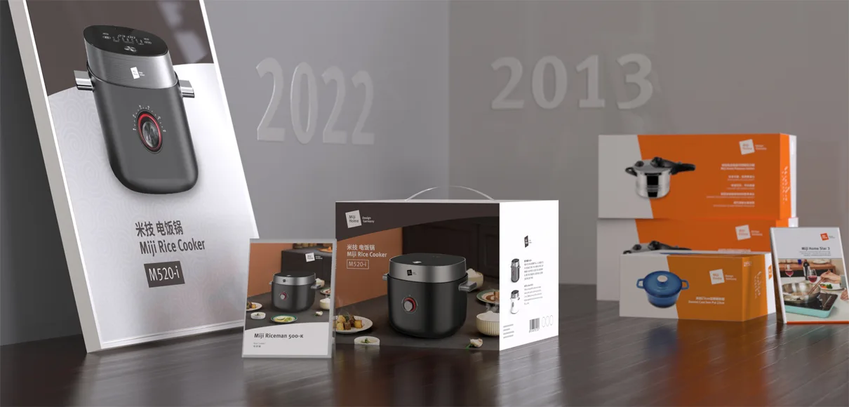
When we developed the Miji brand system in 2013, the role of the Miji Home brand was that of a more affordable sister brand with basically the same products of the core brand Miji Design Germany.
The target audience for the Miji Home brand is younger and more interested in contemporary style, so product design and branding went for a more colorful and dynamic tonality.
After some years the product portfolio became more mature. Miji Home now covers a much wider range now than intended and as such is inherently different from Miji Design Germany as the stove and mobile cooker expert brand.
To better reflect this new situation, we gave the Miji Home brand a make-over that conveys a more flexible and mature character allowing Miji Home to be more independent from the Miji Design Germany mother brand. However, the challenge was to not sever the strong connection to the Miji brand framework. Moving away from the vibrant lead color orange to a more comfortable and neutral brown allows the products to shine. A clear brand bar on the packaging and communication material establishes confident brand communication that fits well into the Miji brand framework.
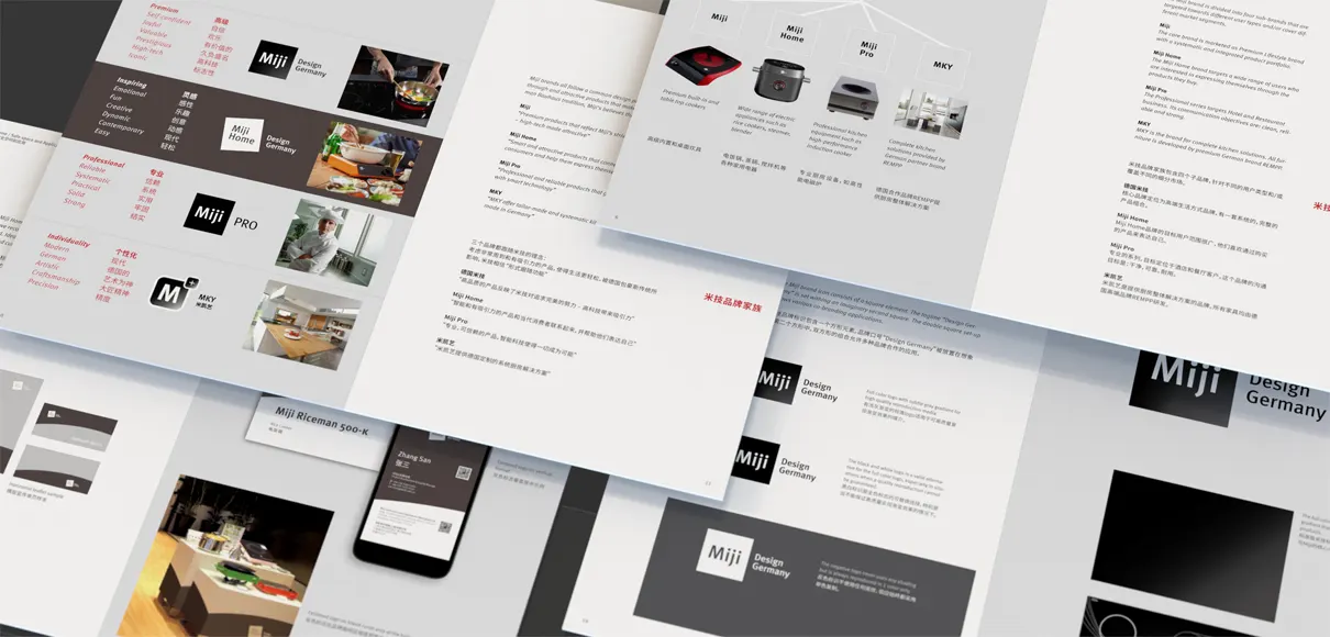
We completely overhauled the brand book, that lays down the principles for all Miji brands and developed the lead templates for packaging and brand communication.

