Systematic and Fresh Biopharma
After the very fast-paced development of the basic brand framework and brand website, we stepped back a bit and defined the brand system for Chime Biologics in detail.
As is often the case for Chinese companies with international reach, we developed a prioritized, multi-language brand system that includes alphabetic, Chinese and bi-lingual logotypes.
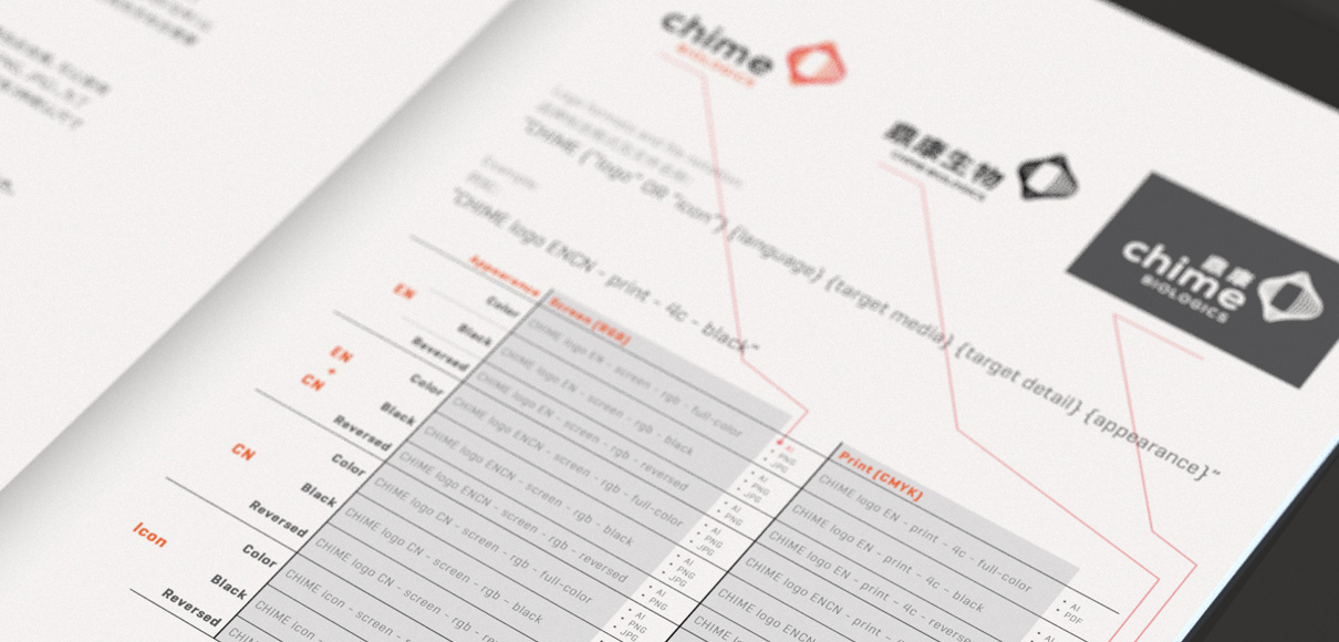
Since logo artwork is provided in several formats and color systems, the logo library is rather complex with over 100 individual files. Clear notation and filing are crucial to help the client and their suppliers find the right format.
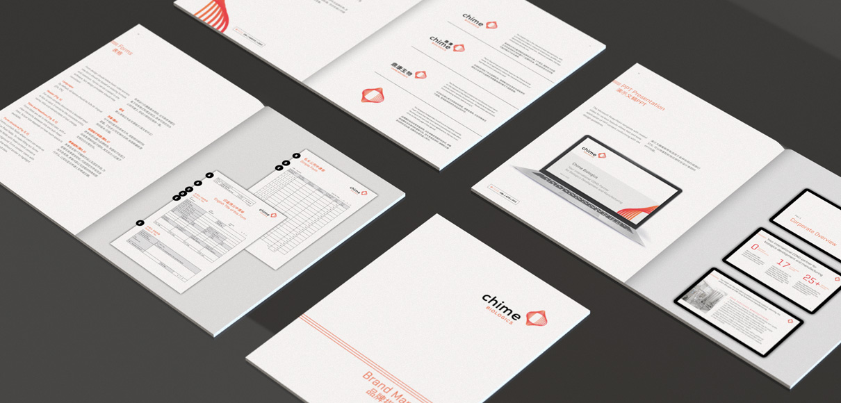
All this, as well as all stationery items, PPT templates and other artwork are collected and defined in the brand manual. For print materials the guidelines contain production specifications and recommendations, such as what kind of binding to use, what paper brand and weight and more.
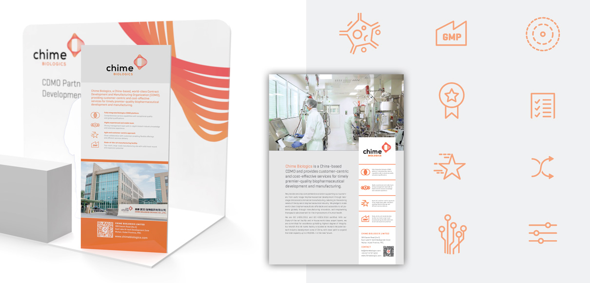
Apart from the stationery, the first public appearance of the new brand came with at a biopharma congress where we supported Chime with a small booth design including all collateral, from pull-up banners to advertisements for the event catalogue.
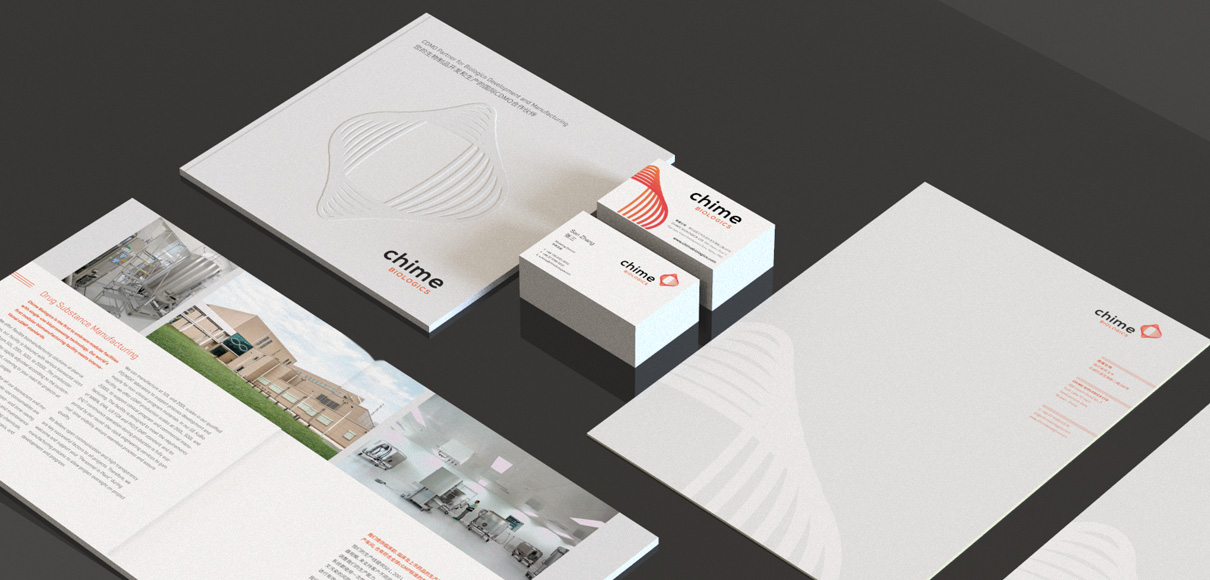
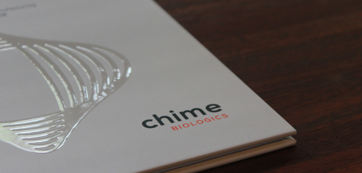
The new brand brochure had its first appearance as well. With a smooth, UV-coated brand icon on the cover, the brochure stands out and presents Chime Biologics and their services in English and Chinese.
Throughout our project the client has been highly responsive and decisive, making this branding project a smooth and joyful experience for our team.
