CI Design for China with 6 Sharp Edges
Ambrosius China is a well-known name in the exhibition industry. Trusted by multi-national clients, their corporate design needs to work internationally and in China.
Their visual identity design, usually hidden behind their famous clients’ brands was outdated. The use of the logo and design elements was inconsistent, as there were no clear visual identity guidelines available. Different sales managers used their own presentation designs and much time was misused by unnecessary internal re-designs.
When we began to define the brand identity for Ambrosius China, we first did a thorough brand audit to find out which brand elements work well, and which should be changed. In several brand workshops, we then defined the brand keywords for Ambrosius China together with the client.
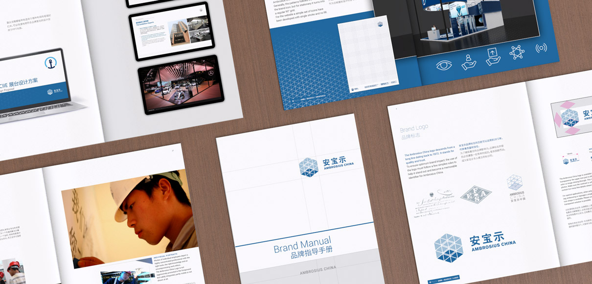
After several months, we arrived at a well-defined corporate identity with a clear bi-lingual brand logo, usage rules, presentation guidelines, and a completely redesigned website.
The brand logo picks up historic elements of the company logo from Ambrosius and Söhne in Germany founded in 1872, which later became the spin-off Ambrosius China.
Have a look at their exiting exhibition projects under:
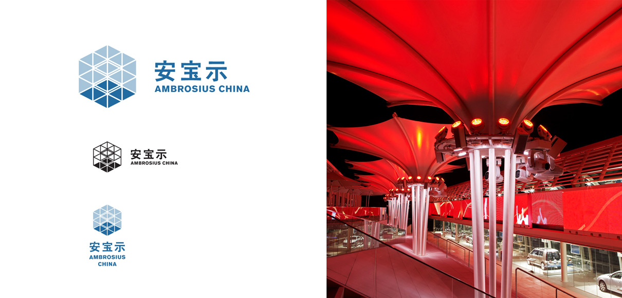
The English/Chinese Logo system allows flexible usage of the brand logo while giving clear priority to the master logo.
The semitransparent brand logo stands out on top of project photos.
Key values and usage of the brand are defined in the brand guidelines
The fully responsive brand website showcases several projects and is presented in 3 languages (Chinese, English, German)


