Engineering. Tailored.
RoyalTurbo is specialized in providing customized compressor workflows for industrial clients. They work closely with leading international manufacturers and combine international as well as local Chinese project management expertise.
JungleFish was engaged to upgrade the messaging and visual identity and implement it across online and print media.
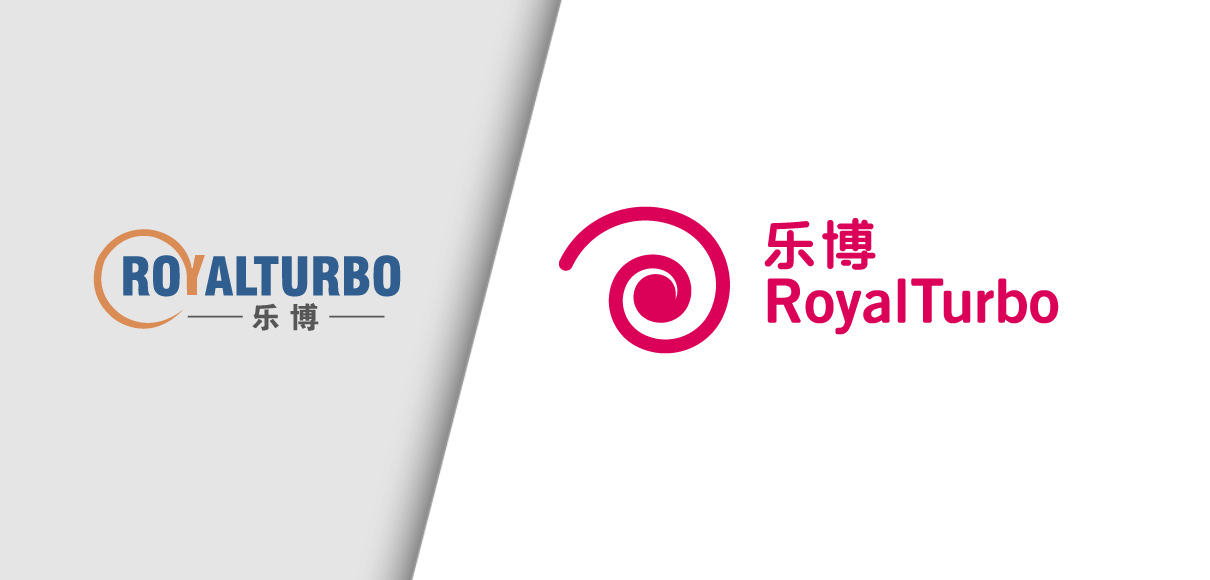
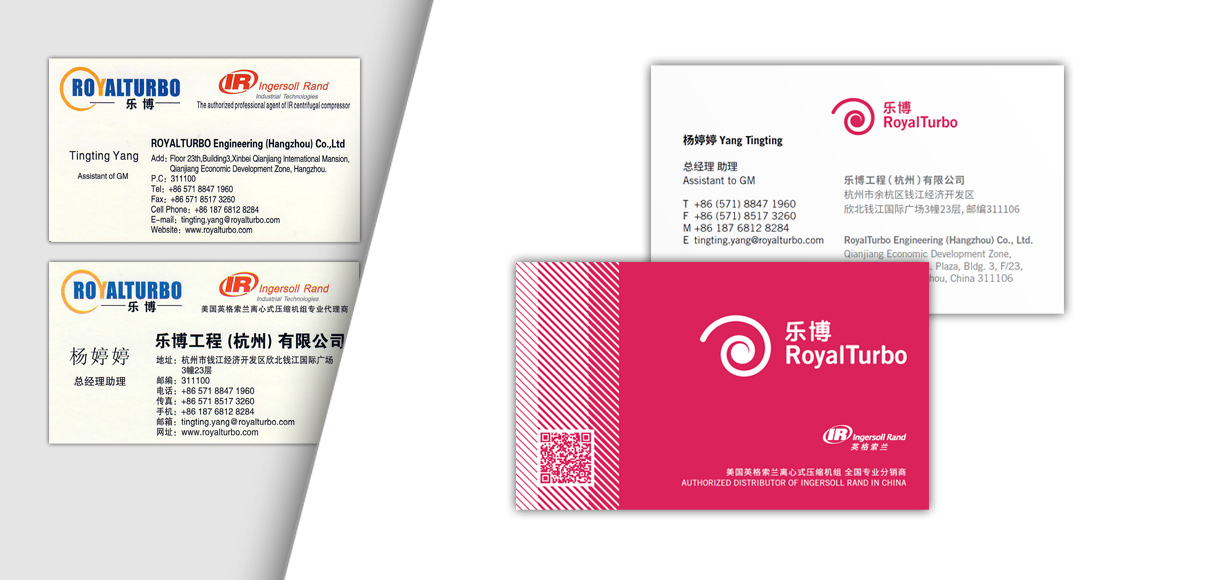
After several brand and messaging workshop at client’s headquarter in Hangzhou, the design direction was agreed on and we created the new brand language – please see below a side-by-side review of this transformation.
Related Projects
Related Topics
Clarity and Simplicity: In the complex business environment in which RoyalTurbo operates, clear communication is highly appreciated. In our initial brand audit, we identified these issues with the existing brand logo:
- Weak and overused color scheme: lead color blue is industry-wide the most frequently used color and provides little distinction.
- Color complexity: the yellow accent color is weak in contrast and a third color for the Chinese logotype brings the total to 3 colors in one brand logo: unnecessary complex
- The Chinese brand name, which is the most commonly used, received too little attention graphically and appears as a simple add-on
- The all capital-letter typesetting of “ROYALTURBO” in a compressed bold typeface makes the word difficult to grasp at a glance.
Based on review of all communication tools and competitor research, we created several candidates with a strong, clear color scheme and equality between Chinese and English logotype. As the Chinese name doesn’t reveal anything about the client’s industry, we gave more focus to a strong brand icon of the impellor, the crucial part of any rotary compressor.
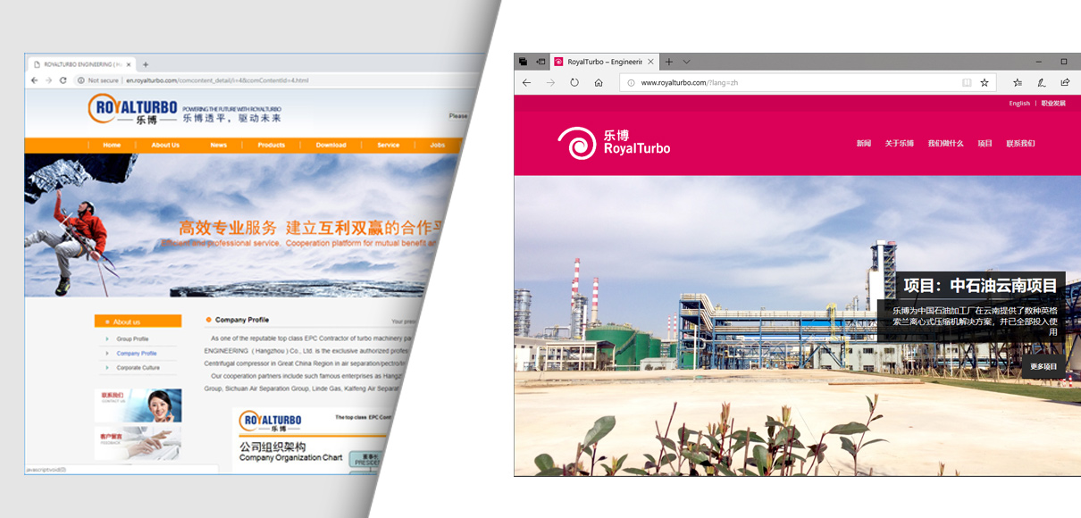
The existing website made use of many stock images without any relation to the client’s business. Furthermore, these stock photos and compositions were highly diverse in style and tonality. Based on target group analysis we opted for down-to-earth and realistic imagery that shows our client’s products and projects without resorting to overly philosophical visuals.
The old website contains many pages, often with little or incomplete information. In our completely redesigned website for RoyalTurbo most content is accessible within the same page – reducing loading time and clicks to reach crucial information. In addition to the improved usability, the new website now is fully bi-lingual.
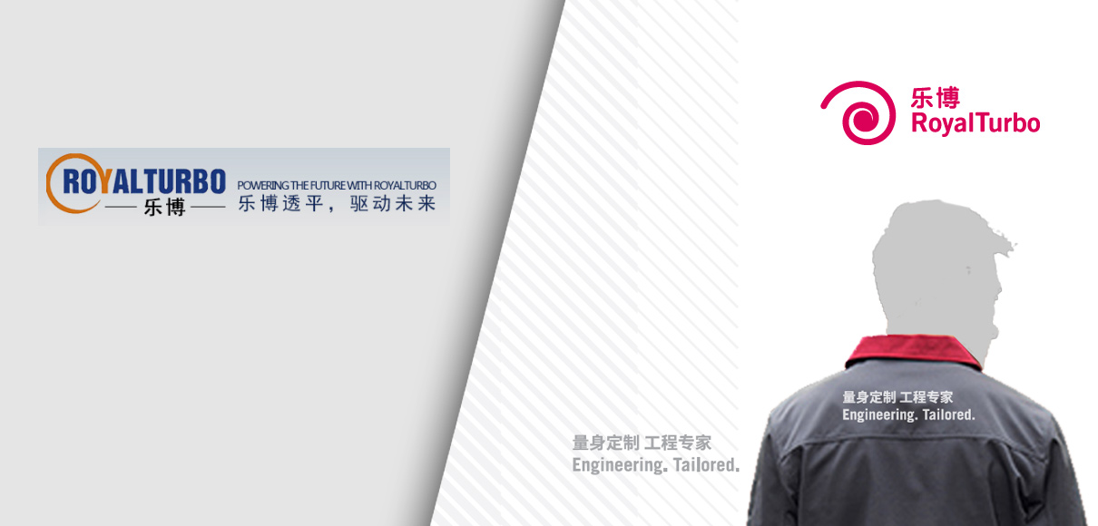
Instead of a complex tagline that further clutters the logo, we introduced a new slogan “Engineering. Tailored” which unpretentiously puts forward the key points for RoyalTurbo. As a general rule, the slogan is not set directly next to the logo but either on a reversed side or on opposing edges of a page layout.
The business card layout had several issues in terms of information hierarchy: the legal name of the company was set extremely large and bold, even competing with the brand logo in size, while the individuals name was set in light Song font. Left alignment and center alignment were used side-by-side and the partner logo of Ingersoll Rand was given the same real estate as the brand logo creating confusion of the brand origin and ownership.
The revised layout maintains a clear division: one side for brand impact, one side for information. The distinctive new lead color is used on the brand side together with the custom “density”-gradient (which symbolized different air pressure states). A clear brand hierarchy avoids confusion and setting both logos reversed against the brand color avoids competing color schemes.
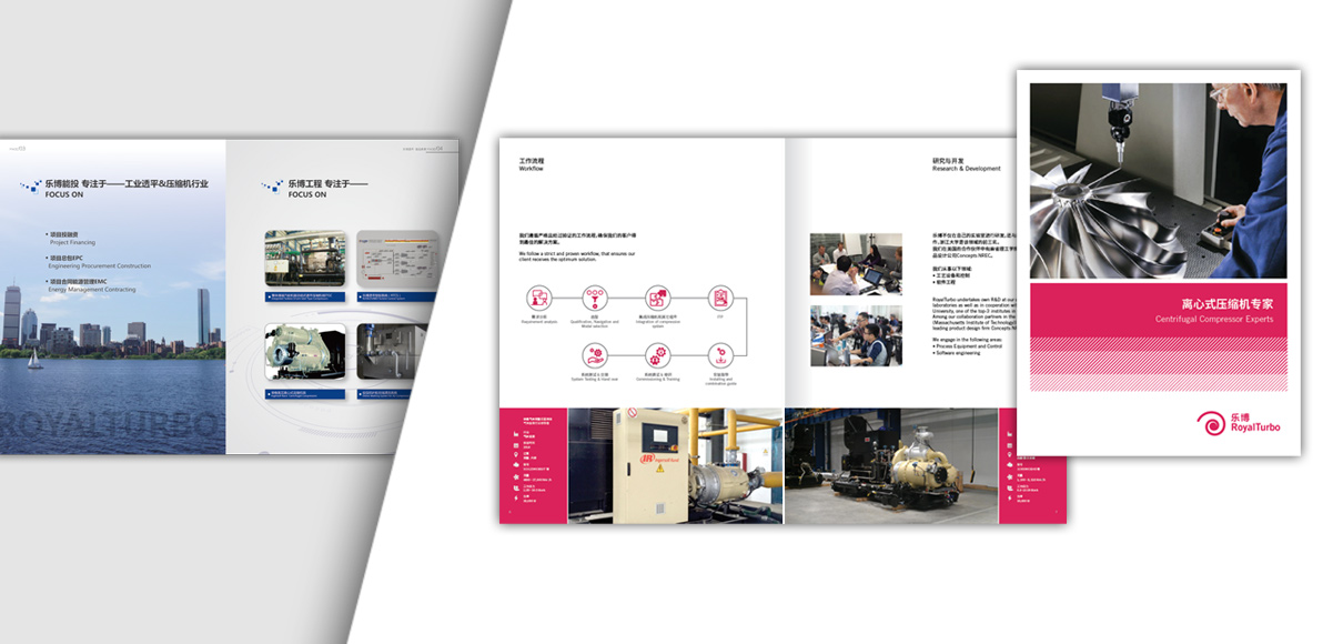
The existing company brochure had very little visual connection with either the old website or stationery. The redesign makes determined use of all newly established brand elements:
- strong brand color impact: on the cover, as highlight color, for infographics and icons
- The “density” gradient on the cover provides strong recognition that can even surpass the logo as the main identifier of the brand
- Only facts and information that are relevant are presented. Unrealistic and lofty imagery that doesn’t connect with the business are replaced by actual project photos and hands-on visuals that show and explain what is important
With a clear and consistent branding and messaging both online and offline, RoyalTurbo can now ascertain its position of engineering competence and communicate more effectively – and convincingly — to domestic Chinese clients and international business partners.
