Brand Consolidation: Inclusion Factory
For the last 6 months, Inclusion Factory management and branding firm JungleFish were working on updating and consolidation the branding for Inclusion Factory. While most clients might barely notice the changes, we want to explain the reasons for this step and how it can help us grow.
Formulate the Brand DNA
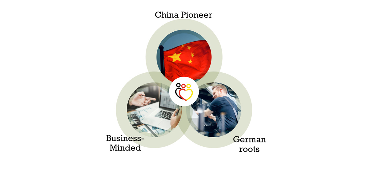
Everyone has a slightly different understanding about the company/brand they work for. However, to help unify this brand perception and to align on the fundamentals of the brand we needed to identify the brand’s DNA or core stories, that make this brand unique. For Inclusion Factory these are:
- China Pioneer: As one of the first private companies in China, Inclusion Factory stands at the forefront of a social movement for inclusion. Other than foreign NGOs, the Taicang Inclusion Factory is a wholly Chinese enterprise and firmly rooted in China.
- Business-minded: While we subscribe to a higher social purpose, our approach is business-like: we aim to understand our customers and deliver state-of-the-art quality in consulting and production. Other than state-run entities with the objective to facilitate inclusion, the Inclusion Factory is also a working enterprise that has to “earn its keep” – this helps us to better understand our clients. We adhere to industry-standards such as ISO 9001 and employ professional tools and methods such as SAP software and international management principles.
- German roots: Founded by a group of German businesspeople, the Inclusion Factory is heavily influenced by a practical and solution-oriented mind-set. While the Inclusion Factory now serves multinational and domestic clients, the German flag colors in our brand identity remind us of our origins.
Better integrate and explain the expanded service offer
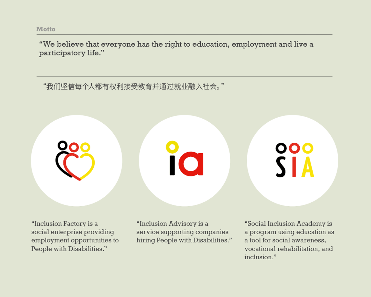
Since 2016 Inclusion Factory expanded their scope considerably: in addition to the Inclusion Factory workshop that provides assembly for industrial clients, the Inclusion Advisory (IA) offers consulting services to businesses for inclusion related topics and the Social Inclusion Academy (SIA) conducts trainings. When these “business units” started in 2017 and 2018 we added logos to identify them but there was no guideline for the whole offering.
One of the key objectives of this branding exercise was therefore, to define how this wider offering can be integrated in all corporate and marketing communication.
The most crucial step before going into design is to define the messaging: we needed first to understand the offering and then to define it verbally in Chinese and English. The same tone of voice should be used when introducing one or more of the Inclusion Group entities. This task is of utmost importance. In our past work we found that many times, messaging was recreated each time for a new publication. Different versions co-existed, and it was up to the presenter which one they preferred. Extra work and confusing communication had been the result.
With the new branding we now introduce a clear messaging guideline, as well as a shared motto or objective. This avoids confusion for both, clients and internal team and helps to establish the Inclusion Factory as a brand.
Simpler and clearer messaging and design
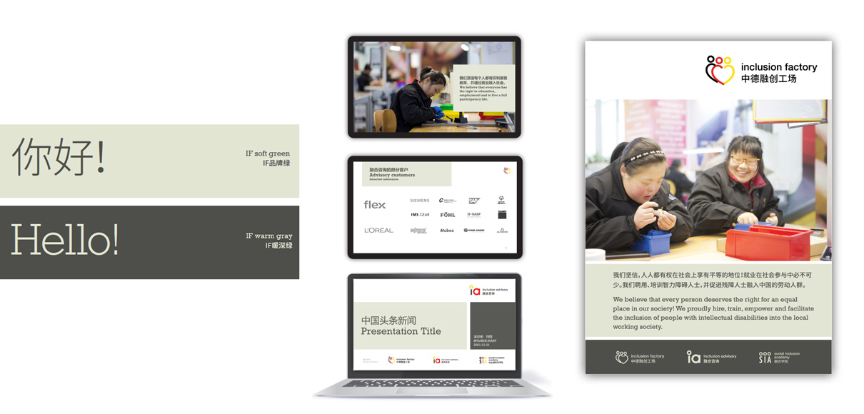
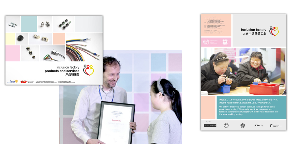
Apart from the consolidated messaging we also cleaned house visually: the color blocks, which were a signature design element in past communication materials are gone as their playfulness conflicted with the increased professionalism of the organization.
Instead of managing 5+ colors, we have only to consider 2 now: a friendly muted green tone and a strong warm gray. This change makes a huge difference in perception, possibly bigger than changing the logo(s) would have made.
Say it with confidence
The typographic concept underwent a major change: a new corporate font with more confidence and character expresses the solidified standing of IF. The typesetting is, in general, much larger to highlight the message and also to make texts easier to read for people with visual impairment. On business cards, for example, the names are now set in 15 Points compared to previously 8pt. Similar changes have been made to presentation and website.
Growing pains
Changing a company’s branding is never easy and often is met with considerable resistance. New templates must be installed, new rules observed. Any why? Because somebody didn’t like a specific color or font? Ideally the new branding not only better reflects who this company now is, but also makes it easier for them to do business, to talk to people, to convey its messages.
With the clear and confident communication of the integrated offering, Inclusion Factory can reach more potential clients and bring more People with Disabilities into employment.


