Juicy Tangerines
“Vitamin C, strong health, energy” – key attributes of one of the key products of Tony’s Farm – Tangerines! To be able to attract the right audience to the product Tony’s Farm approached us to create a new, compelling and modern design of the package for his tangerines.
The design briefing was wide open, which allowed us to explore very different design direction.
First Concept
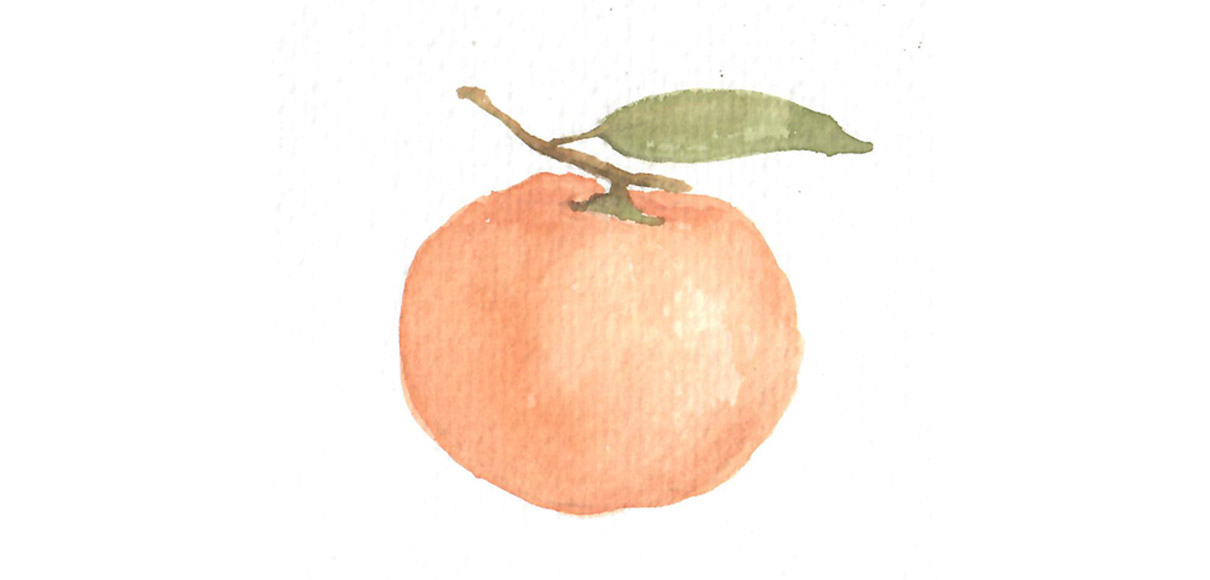
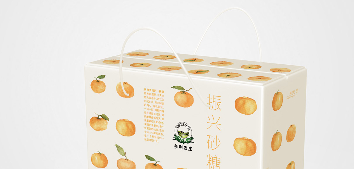
The first concept emphasizes friendly, natural and organic characteristics: Hand-painted watercolor renderings of tangerines line-up nicely as they are arranged inside the box. You see what you get – but in a very appealing way.
The color contrast of the tangerines’ orange with the dark green leaves appears fresh and delicious. Unlike other artistic package designs, this one also clearly shows how many fruits are packed inside – from all angles. The green leaves correspond nicely with Tony’s Farm brand logo (which we developed in 2012) , also embedded in dark green foliage.
Second Concept
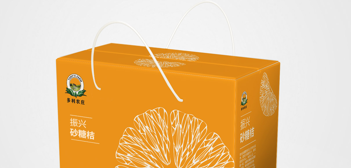
Our second approach, featured a more modern tonality: the intricate cell structure of the tangerines provided us with a visually interesting pattern. The juiciness of the product is highlighted by a full color deep orange against which the white cell structure stands out memorably.
This design is clean and modern and connects with the “veggie patterns”, a range of symmetrical patterns made of vegetable photos, which is an important element in Tony’s Farm’s Visual Identity.
Third Concept
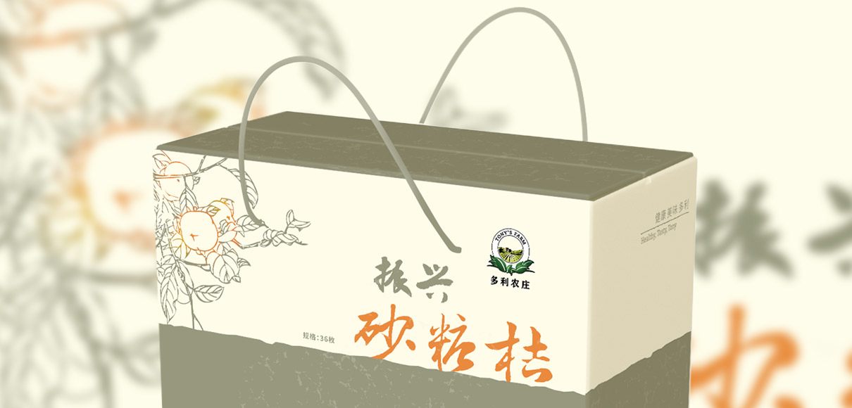
The third direction conveys a more premium tonality, with subdued colors and a classic wood-cut illustration. The subtle orange gradient towards the tangerine leads the eye and adds a modern twist to the classical layout.
The third concept was selected for production. JungleFish worked closely with Tony’s Farm production team to allow cost-effective and flawless production.
A broad range of concepts – and a refreshing exercise for our team.
